In the above visualization we can see the fish and seafood consumption in the countries of the world. You can use the slider above this chart to observe the changes over the years. The more blue the regions are, the more the consumption is in these places, according to the colorbar below the chart. The conclusion is that as the years pass, the consumption of fish and seafood increases rapidly and especially in the Mediterranean countries (Spain, Portugal), Nordic countries (Iceland and Norway) and Asia (Malaysia, Indonesia, China, Japan). It is remarkable to say that the rest of the charts are interlinked with the map and slider and they will change accordingly.

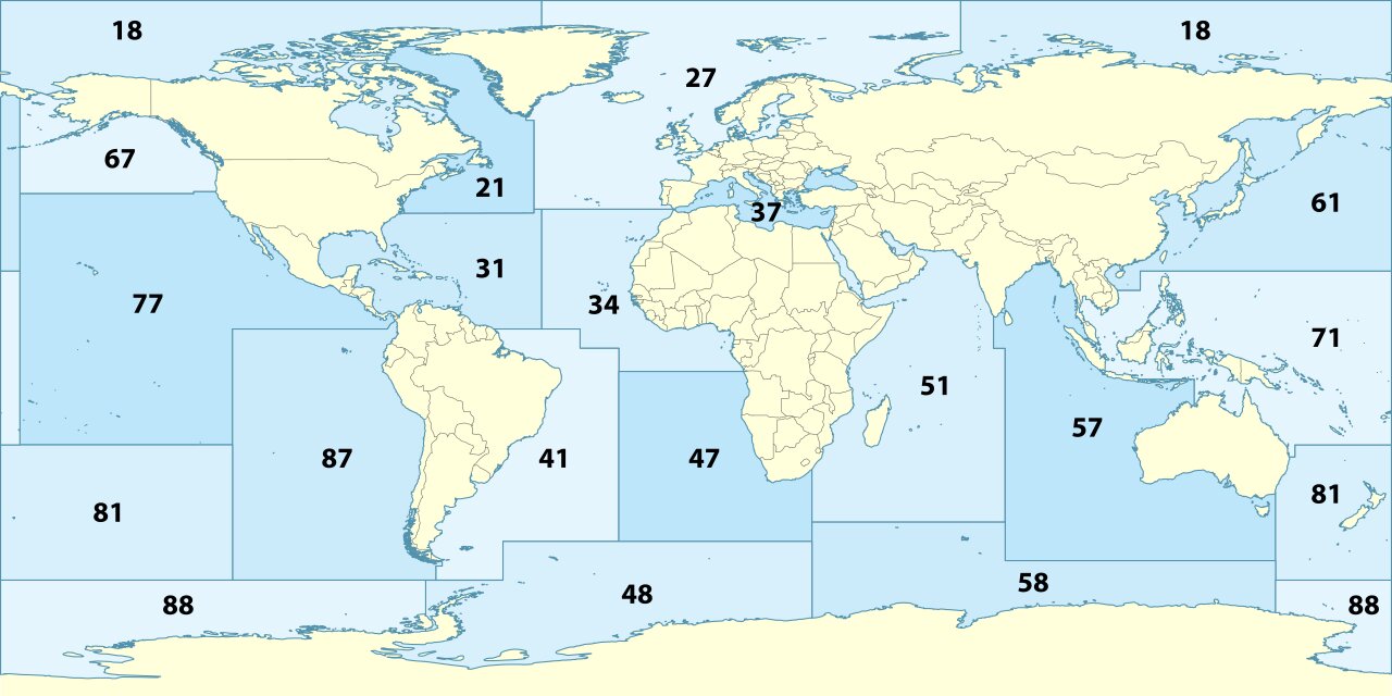
In the above chart we can see that the percentage of the overexploited fish stocks worldwide is concerning. Especially in the Mediterranean and the Black Sea and some parts of the Atlantic, this percentage is much worse.
Here we can observe that the countries with the largest production are countries with large population (China, Russia, USA, India) or coutries that have a tradition in fish production (Indonesia, Japan). You can click a country on the map to find the corresponding line in this chart.
In chart above, we can observe that the production of aquaculture worldwide increases rapidly as time passes, while the production of fisheries increases with a much slower rate. This is a very significant result which is successfully captured through our data. You can press any country in the world map and the above chart will change the area lineplot accordingly. Press again the same country to go back to the worldwide data.
In the above spider chart, we can notice that the industrial fishing sector far outweights the other sectors. And as time passes it increases even more. We can also see that discards increase as well but not in the same pace as the industrial fishing which can be considered as a positive sign.